Learn how to choose the right font and its impact on employers. Discover font styles that enhance readability and create a professional appearance.When it comes to creating a standout resume, many elements come into play, and one of the most underrated aspects is the font style. Your choice of font can greatly impact how your resume is perceived by potential employers. In this blog post, we will explore the importance of choosing the right font style for your resume and the impact it can have on employers. We will also discuss font styles that enhance readability and how to create a professional appearance through your font choice. Whether you’re a recent graduate entering the job market or a seasoned professional looking for a career change, the font style of your resume is an important factor to consider. Let’s dive into the world of fonts and discover how to make your resume stand out for all the right reasons.
Choosing the Right Font
When it comes to creating a professional and visually appealing resume, selecting the right font plays a crucial role. The font you choose can either enhance the readability of your resume or make it difficult for potential employers to read. Therefore, it’s important to consider various factors before deciding on the font style for your resume.
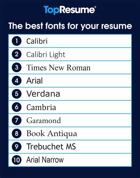
One of the key factors to consider is the legibility of the font. It’s essential to choose a font that is easy to read and doesn’t strain the eyes. Sans-serif fonts such as Arial, Calibri, and Helvetica are popular choices for resumes as they are clean, modern, and easy to read. On the other hand, decorative or script fonts may be visually appealing but can be difficult to read, especially in smaller sizes.
Another factor to consider is the professionalism of the font. The font you choose should reflect the industry you are applying for and the level of formality required. For example, if you’re applying for a corporate position, a classic and professional font such as Times New Roman or Garamond may be more suitable. However, if you’re applying for a creative role, a more modern and stylish font like Roboto or Avenir may be a better fit.
Impact of Font Style on Employers
When it comes to creating a resume, the font style you choose can make a huge impact on how potential employers perceive you. The font style of your resume can affect the overall impression you make, whether it’s professional, creative, or outdated. It’s important to consider the impact of font style on employers when crafting your resume.
Using a modern and clean font style can convey professionalism and attention to detail. Fonts like Arial, Calibri, and Helvetica are widely accepted and can present your resume in a polished and professional manner. Employers often appreciate the simplicity and readability of these font styles, making it easier for them to review your qualifications and experience.
On the other hand, using a distracting or overly decorative font style may give the impression of unprofessionalism and lack of seriousness. Fonts with excessive embellishments or flourishes can be difficult to read and may distract employers from the content of your resume. It’s best to avoid using these font styles to maintain a professional and polished appearance.
Font Styles That Enhance Readability
Font Styles That Enhance Readability
When it comes to creating a professional appearance for your written documents, the font style you choose can make a significant impact on how the content is perceived. One of the most important factors to consider when selecting a font style is its readability. The right font style can enhance the readability of your document and make it easier for readers to process the information.
Some font styles that are known for enhancing readability include Times New Roman, Arial, and Calibri. These fonts are widely used in professional settings because of their clean and easy-to-read appearance. Additionally, they are designed to be legible at various sizes, making them suitable for both print and digital documents. Choosing a font style that enhances readability can help ensure that your document is accessible to a wide audience and can be easily understood.
In addition to the actual font style itself, another factor to consider is the size of the font. A font that is too small may be difficult for some readers to see, while a font that is too large can be overwhelming. Finding the right balance in font size, paired with a readable font style, can improve the overall readability of your document.
Creating a Professional Appearance
When it comes to creating a professional appearance, one of the most important factors to consider is the font style that you use. The font style you choose can have a significant impact on how your document is perceived by others, particularly when it comes to potential employers. It’s essential to select a font that is clean, modern, and easy to read. This will not only make your document more visually appealing, but it will also communicate professionalism and attention to detail.
One of the most popular font styles for creating a professional appearance is Arial. Arial is a sans-serif font that is known for its clean and modern look. It is easy to read and works well for both printed and digital documents. Another popular choice is Times New Roman, which is a classic serif font that is often used in professional documents. Times New Roman conveys a sense of tradition and authority, making it an excellent choice for resumes, cover letters, and other professional materials.
In addition to choosing the right font style, it’s essential to pay attention to other aspects of typography, such as font size, spacing, and alignment. Using a consistent and appropriate font size throughout your document will help to create a polished and cohesive look. Proper spacing and alignment will also help to make your document more readable and visually appealing. By paying attention to these details, you can ensure that your document presents a professional appearance that will impress potential employers.